 Also I have a sailing regatta at 12 today, rory'll be there (i hope) and rory, if your reading this i dont have your password thing yet. I'm hoping to get some skating in afterwards but its ending at 3 so i dont know if i'll have time to go into bray. I gotta go have breakfast now, bye
*update*
I have done some work, and it now comes in green: 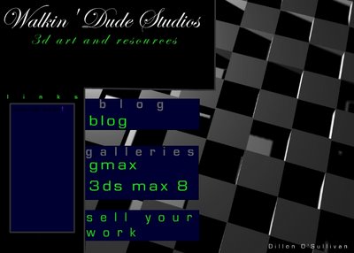
*update*
and this time a more simple orange design:
10 comments:
Being a purple girl and fondly remembering my purple docs I'd plump for the purple!
I never liked purple.
Your mum's bedroom was a sissy purple colour when were young.
If it was me I would choose orange or a dark torquoise blue/green.
But that's just me.
I love those two colours together which is why they define my own blog.
The only room I remember having influence over was my blue bedroom when I was nine!
Dillon I like both but maybe the purple doesn't look as dramatic. There is no reason why it can't be purple if that's your choice. Hope you enjoyed the regatta and hope you had time to skate as well. Grandma PS enjoy your hike is it Tues??
yeah, its tuesday. Im working on another design. They will have to battle it out. (didnt get time to skate)
The orange one looks good Grandma
are you using mixed perspectives in the orange one?
something seems not quite right but it could have something to do with an optical illusion.
they just dont look aligned equally.
I would play some more with the composition, aiming for a more even spacing between the elements
The orange one is a 3d image with alpha squares over the words which are programmed as buttons on release, yes all the writing is different sizes and different heights.
Do you mean make the words smaller and more uniform?
*its all the same perspective, there is only one image there*
Ok - if everything is taken through the same camera, and as long as everything is on parallel planes, and as long as nothing is rotated then the perspective will be ok.
But I think you should move the word 'links' to the left to balance out the space around the boxes more. The s is very close to the cube so it doesn't balance with the word blog which has more space around it.
Post a Comment